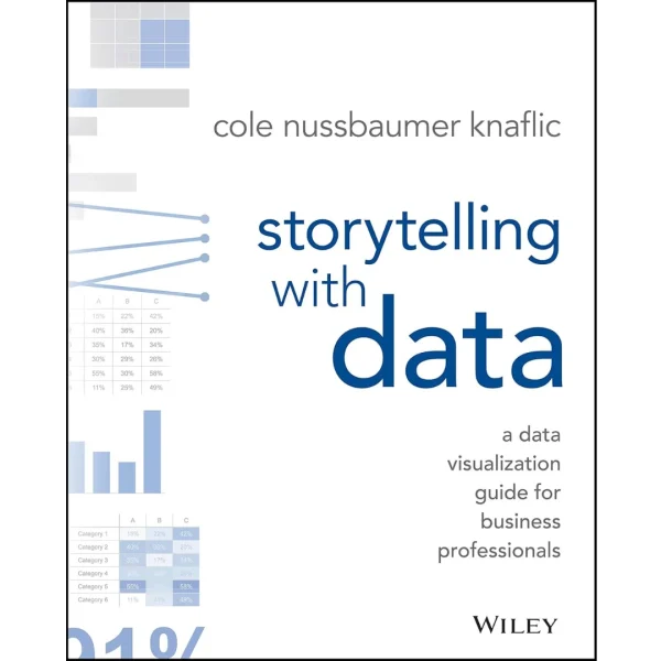
Storytelling with Data: A Data Visualization Guide for Business Professionals
Original price was: $41.99.$18.99Current price is: $18.99.
PDF 4,25 MB • Pages: 796
Don’t simply show your data—tell a story with it! Storytelling with Data teaches you the fundamentals of data visualization and how to communicate effectively with data. You’ll discover the power of storytelling and the way to make data a pivotal point in your story. The lessons in this illuminative text are grounded in theory, but made accessible through numerous real-world examples—ready for immediate application to your next graph or presentation.
Storytelling is not an inherent skill, especially when it comes to data visualization, and the tools at our disposal don’t make it any easier. This book demonstrates how to go beyond conventional tools to reach the root of your data, and how to use your data to create an engaging, informative, compelling story. Specifically, you’ll learn how to:
- Understand the importance of context and audience
- Determine the appropriate type of graph for your situation
- Recognize and eliminate the clutter clouding your information
- Direct your audience’s attention to the most important parts of your data
- Think like a designer and utilize concepts of design in data visualization
- Leverage the power of storytelling to help your message resonate with your audience
Together, the lessons in this book will help you turn your data into high impact visual stories that stick with your audience. Rid your world of ineffective graphs, one exploding 3D pie chart at a time. There is a story in your data—Storytelling with Data will give you the skills and power to tell it.
27 reviews for Storytelling with Data: A Data Visualization Guide for Business Professionals
You must be logged in to post a review.




























Evgeni Stavinov (verified owner) –
It’s certainly a valuable and well-written book. It provides ground rules of creating good and avoiding bad visualizations.
However, I feel it’s somewhat opinionated, and readers should take recommendations with a grain of salt.
In general, visualization is a highly subjective topic. There is no “one size fits all”. Here are few examples.
Cole (the author) makes a case against pie charts. Well, theoretically I agree with the arguments of totally banning pie charts. But there must be a reason why pie charts are part of each and every visualization tools in existence. Many people find it useful, including myself.
Completely banning 3-D visualizations because they might distort data interpretation is an appealing argument. But in many cases 3-D just looks nice and aesthetic, and doesn’t distort anything.
Regarding color scheme design. I personally like bright colors, and so do many other people. I simply refuse drawing a heatmap using shades of blue, as recommended in the book.
David S. Saunders (verified owner) –
This is a well-written guide to being more effective with the presentation of data. Unlike some other books on the subject, this is not just a book on PowerPoint branded as a book on data. This is a book about making sense of data that make sense to you, and then presenting it effectively in a way that gets the point across and tells the story you want understood to your audience. the audience for this book is the person that is intimate with a particular kind of data. This person probably sees things in the numbers that a general audience doesn’t get. Simply taking that information and putting into a PowerPoint slide is not going to get results. These kind of people need help building a bridge between their data and the audience. That’s what this book is about..
Steve Kline (verified owner) –
A very good introductory book to the world of storytelling with data and data visualization. You get some of the science behind why certain data visualizations work without feeling overwhelmed. And, you get some really good takeaways to key in on in your own work. After reading this book (and one or two others), people noticed how much my visualizations had improved.
Cole’s blog is excellent resource as well – particularly when she takes a not-so-great chart and makes it really tell the story.
K. McDowell (verified owner) –
This book focuses on data, with a chapter on storytelling. As a storytelling expert, I like the book, and I’ve used it in my co-taught data science storytelling course. What I do not like is that the author has copyrighted the phrase “storytelling with data,” and has her lawyer send out cease and desist notices to anyone who uses the phrase. As a storytelling expert who works with data, it is absurd to me that Knaflic, who is clearly a data expert who works with story, should “own” such a common phrase. I hope someone takes her to court and wins. I don’t have time for this fight. I still believe in the book, and I will assign it in my class for fall again, but I am deeply disappointed in the idea that this author “owns” the phrase “storytelling with data.” It is a frustrating time indeed to try to speak the language of ideas. I hope she will have a change of heart.
Katie (verified owner) –
The reviewers being critical of this book were expecting too much out of it. This book opens your eyes to some of the dumb ways we try to report out information to business leaders and does a great job of providing tips and also pushing us to think about the multiple ways we can present data. I would recommend to anyone that needs to report out certain metrics to client or the business leads in your organization!
Puneet S. Lamba (verified owner) –
I find this book very useful and have stuck with reading through it (just finished chapter 5, so I’m more than halfway through) even though the binding sucks, and the book seems to be falling apart. Although none of the pages have fallen out, it’s no fun to read a book with a broken spine.
J. Edgar (verified owner) –
There is some good stuff in here.
I like Knaflic’s focus on intentionality. For her, the defaults are something that should be avoided, or at least justified.
I like how she looks at the presentation of graphic information as a story arc. There is one thing that you want to focus on to create actionable decisions. This is best, as she describes, if you are presenting. There are limitations if you have a static document that has information for multiple stakeholders.
The book is accessibly written with a clean font and plenty of examples.
However, I do have to push back a bit. She follows Tufte in trying to eliminate data ink. Part of the intentionality is that you have less and less information on the page and every thing you includes helps tell your story. For me though that leads to a sameness. You want your audience to not have to think so hard. You want to make sure they don’t have their eyes glaze over. But that means that everything is very simple with a muted palette. The author notes that some of these are just her preference, but the mode of thinking has become influential. Part of me wants my audience to do some work in understanding the text I put in front of them. It means a level of engagement that I worry a too-simple graph leaves out.
Dick Whittington (verified owner) –
Recommendations and examples on how to show data in unique and non-traditional ways. Also a push towards turning data into stories. As a researcher I enjoyed both. Not for everyone.
Lindsay Harris (verified owner) –
Definitely helpful for reporting job tho I’m not sure I am so against donut charts as the author lol this seemed more geared toward presentation reporting while I do more operational type reporting. Still helpful tho.