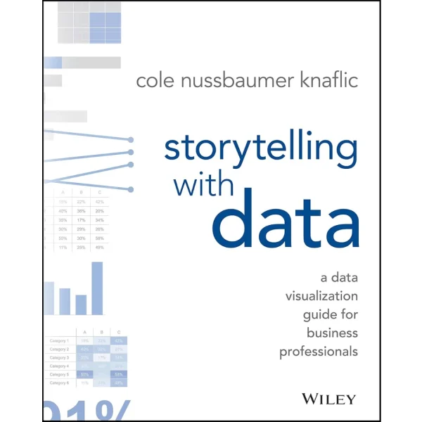
Storytelling with Data: A Data Visualization Guide for Business Professionals
Original price was: $41.99.$18.99Current price is: $18.99.
PDF 4,25 MB • Pages: 796
Don’t simply show your data—tell a story with it! Storytelling with Data teaches you the fundamentals of data visualization and how to communicate effectively with data. You’ll discover the power of storytelling and the way to make data a pivotal point in your story. The lessons in this illuminative text are grounded in theory, but made accessible through numerous real-world examples—ready for immediate application to your next graph or presentation.
Storytelling is not an inherent skill, especially when it comes to data visualization, and the tools at our disposal don’t make it any easier. This book demonstrates how to go beyond conventional tools to reach the root of your data, and how to use your data to create an engaging, informative, compelling story. Specifically, you’ll learn how to:
- Understand the importance of context and audience
- Determine the appropriate type of graph for your situation
- Recognize and eliminate the clutter clouding your information
- Direct your audience’s attention to the most important parts of your data
- Think like a designer and utilize concepts of design in data visualization
- Leverage the power of storytelling to help your message resonate with your audience
Together, the lessons in this book will help you turn your data into high impact visual stories that stick with your audience. Rid your world of ineffective graphs, one exploding 3D pie chart at a time. There is a story in your data—Storytelling with Data will give you the skills and power to tell it.
27 reviews for Storytelling with Data: A Data Visualization Guide for Business Professionals
You must be logged in to post a review.

































Breck (verified owner) –
This is probably the best book on creating data visualizations I’ve come across to date.
Amazing attention to detail: not a tick mark is out of place. The author doesn’t just copy and paste visualizations from other sources (unless used to illustrate common mistakes). Instead she carefully constructs each example putting thought into every bit of ink on the page. As a result, the charts are concise and get to the point without distracting you with details that don’t add information or emphasis. This book helps you understand what’s important in data visualization and helps you highlight the important thing in all the charts you create.
Some examples of skills this book taught me:
– how to use muted colors combined with a few highlights to drastically improve the storytelling aspect of a chart
– add less: unnecessary grid lines, markers, et cetera, can detract from a chart’s story
nits: I like pie charts. I think they make intuitive sense and I even think the pie chart on page 5 would be fine if the author applied the color scheme in the bar chart below that to the pie chart. I agree that 3D pie charts are bad, but 2D pie charts are OK in my book.
I really liked the before and after charts on pages 4 – 6. Would have loved another appendix with a dozen more of these for future fast reference.
I Teach Typing (verified owner) –
I am a university professor who teaches biostatistics and I find this to be one of the best books that bridges the gap between analytics and presentation. There are some excellent books around that show visualization (e.g.,
The Wall Street Journal Guide to Information Graphics: The Dos and Don’ts of Presenting Data, Facts, and Figures
or books by Few
Information Dashboard Design: Displaying Data for At-a-Glance Monitoring
&
Show Me the Numbers: Designing Tables and Graphs to Enlighten
or Cairo
The Truthful Art: Data, Charts, and Maps for Communication
) and there are good books on presentation (in particular I love Duarte’s books
Resonate: Present Visual Stories that Transform Audiences
) but this book is unique in how well it blends the two topics. I have never seen such an excellent presentation on how to build a series of graphics. That is, with books by Few or Cairo you will know how to make *a* great graphic and with advice from Duarte, you can connect with your audience but with this book you will see how to build a series of interrelated graphics that highlight different parts of a dataset. Most of the examples are spun around business but the examples are easy to extend to any field.
While I think the author wrote this for people who do presentations in any quantitative field for a living, this book should be required reading for graduate students preparing to defend a dissertation or thesis.
startup_eng1 (verified owner) –
I work in the project controls arena of large projects that have hundreds, if not thousands of people working on them. A key requirement for project controls is to keep all project personnel informed about the project status. Needless to say engineering plays a major role on these projects and brings lots of data with them; pages and pages of it. As the author points out the analytical types are not necessarily trained on how to tell a story (i.e. communicate) with their data.
For the last 10 years or so, I have developed methods for getting the project story down to a single graphic. It’s usually a large graphic, but a single one. It has the effect of getting everyone on the same page. But for people who are not used to looking at this type of presentation, it can be overwhelming or as the author points out they have to work at it in order to understand it. This was a key point for me.
Before I finished the book, I started making changes in my work products. They were small changes, but the feedback was very positive. One example, do you ever note information in page footers like date, time and maybe filename and path? Does anyone think to put them in the background by using a shade of gray instead of the default black? No! Try it. Then ask for opinions It doesn’t sound like much, but it’s reducing the competition on people’s focus.
This book is great! It’s fairly short to read and has a lot of examples making it easy to follow the author’s intent. She obviously is very good at her profession. If I had to pick one book as a recommendation to someone who wants to learn about making great presentation graphics, I will point to this book. I highly recommend it. But, the book doesn’t stop there, the author has included a listing of resources (e.g. books and websites) for continued learning.
Ray Sims (verified owner) –
An inspiring quick read to help break free of the tyranny of Excel’s default chart styles. The book is packed with practical advice aimed at making your charts and accompanying stories more visually pleasing and impactful. There are many “before and after” examples with explanations of the “why” beyond the suggested improvements. The book provides a good foundation for the reader to then build upon with more advanced books covering (for example) interactive dashboards and the technical details of using various dedicated software data visualization tools — topics that this book doesn’t touch.
After reading some of the negative reviews I almost didn’t purchase the book; however, I took the chance based on the quality of the author’s blog and podcast. Rereading these reviews now, the complaints regarding poor print and binding are likely from a since-resolved bootleg copy issue that the author mentioned in September 2018 a Data Stories podcast. Regarding being too basic, I can only say that I learned some valuable lessons even after several decades in the corporate world using Excel and PowerPoint and also recently completing an online course for how to use Tableau. If you are still debating purchase, do as I did and read some of the Storytelling With Data blog and then decide.
Brant (verified owner) –
I straddle the line between engineering and project management, and thus often find myself making presentations to customers to explain difficult events or analyses, to request more funding for projects, or to provide courses of action for projects. All of these presentations require my colleagues and me to reduce large amounts of data down to a few key points. While we’re good with data, we’re not so fantastic sometimes at presenting it in a simple, compelling way. This book, I am certain, will fix all that.
The book itself is a minimalist, beautiful work of art. The author walks you through 6 key topics for creating interesting, concise, and gorgeous presentations that will get your point across and compel your audience to take action. I read the book in a few days and immediately started adopting the approach in my graphs and presentations. I truly think that everyone – entire teams, really – who must make persuasive presentations should own this book.
B. L. Keller (verified owner) –
Too many times, data presented in charts and graphs do not express specific information. The creation of these charts and graphs misses the point of creating them in the first place.
In Storytelling with Data, the author provides insights on how to utilize graphs and charts to tell a story with your data. The book focuses on several areas to consider when developing storytelling visuals:
– Awareness of Context — Be aware of who will be viewing the visual, what they need to know, what they already know.
– Choose an Effective Visual — What type of visual will best deliver your point.
– Limiting Clutter — Leaving out details that do not add something valuable and making secondary items fade into the background, so they are still available but are not the main focus.
– Focus Audience Attention — Make the essential information of the visual stand out the most through the use of color, spatial layout, and other strategies.
– Think Like a Designer — Keep principles of good design in mind and take the time to make your visuals appealing.
The book goes through each of these points in detail with many before and after examples to show (not just tell) how focusing on certain design aspects can make a huge difference in getting your point across.
I would highly recommend Storytelling with Data to anyone who creates visuals to display details of data.
Daniel Morgan (verified owner) –
I would recommend this book to anyone who is involved with data, math, graphs, design, or who even just has to make tables and graphs casually for work or school.
The fundamental premise of this book is that a lot of people make graphs for exploratory purposes (i.e. data vomit) when they should be focusing on explanation (i.e. story). The rest of the book focuses on ways that you can use your data to tell a narrative story. This will stick with the audience better and also be far easier to understand.
The author has six main lessons:
1. Understand the context.
2. Choose an appropriate visual display.
3. Eliminate clutter.
4. Focus attention where you want it.
5. Think like a designer.
6. Tell a story.
By following these principles and above all preparing our graphs and presentations with our audience in mind, it is possible to create far more effective displays of data.
I have read this book twice, and I would highly recommend it.
Dwayne D (verified owner) –
Yes. This book provides excellent guidance, weighs considerations and shares examples of how to communicate effectively with data. From my standout, however, this book is about how to communicate to persuade, period. This is one of the most compelling and valuable “business” books I have read — because the advice shared in this book is beneficial in so many situations and contexts beyond business scenarios. I love this book.
This book helped me to be more deliberate about what I really aim to achieve when I present — or make a request, or share something I find inspirational or compelling, or essentially whenever I need to make a point. I find the guiding principals universally applicable, such as: reducing the cognitive load of your audience, clearly specifying our recommendation of what our audience should “do” given the information we share, and taking time to crystallize the story of our message.
Thank you, Cole Nussbaumer Knaflic!
Scott Martin (verified owner) –
This book is a fantastic teacher for new analysts and a great book for current analysts who are trying to improve their visualizations skills. I’ve been a fan of this author and her talks for many years based around this book and can’t say enough great things. My organization purchases it for all new hires to help improve their visualization skills!
Julie Brown (verified owner) –
as described
A. Andrade (verified owner) –
Very practical and straightforward guidance for data visualization. The book is fantastic . All that makes it a mandatory reference on storytelling
Katy (verified owner) –
This was a textbook for one of my data visualization classes for my Master’s degree. It is one of two books I have enjoyed reading. It was helpful for my class and has been helpful in my work as a data analyst. I recommend checking out Cole Nussbaumer Knaflic’s blog, Storytelling With Data, as well. It will give you a nice idea of what the book is about.
Nicholas Cranwell (verified owner) –
Es un libro , excelente. Muy claro y muy didáctico. Ayuda a todos a contar de una manera simple lo que uno quiere transmitir. En ventas B2B uno utiliza muchos de los conceptos que Cole menciona en el libro. Lo recomiendo.
RITA N (verified owner) –
Great book, full of insights, even if you are already familiar with the topic.
Colin Weidig (verified owner) –
This book gives both an overall framework for thinking about data visualization and a toolkit for designing the most common types of visualizations. Each type of visualization is presented with insights and practical tips. The book presents all of this material and detail concisely. Well worth a read and occasional review.
Chiun Hsu (verified owner) –
Very insightful and practical instructions with vivid demonstration of how data visualization may empower storytelling. References to online resources are also very useful.
cindy (verified owner) –
This is a must read for anyone creating data visualization. It provides clear, succinct examples and explains why one approach is better than other and is loaded with example visuals. This is a great reference for any person or data team to better enhance their storytelling with data. There aren’t enough encouraging words to express what a game changer this book is.
yoly (verified owner) –
Great book and very insightful. If you work with data and use charts and graphs this is the book for you.